Spark Design System
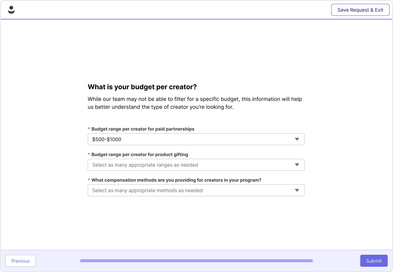
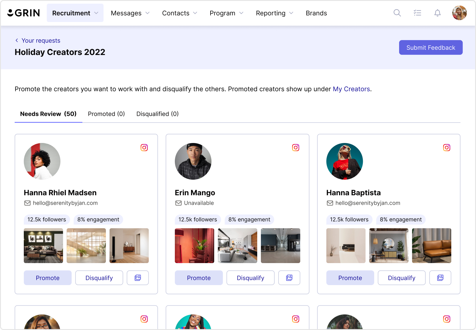
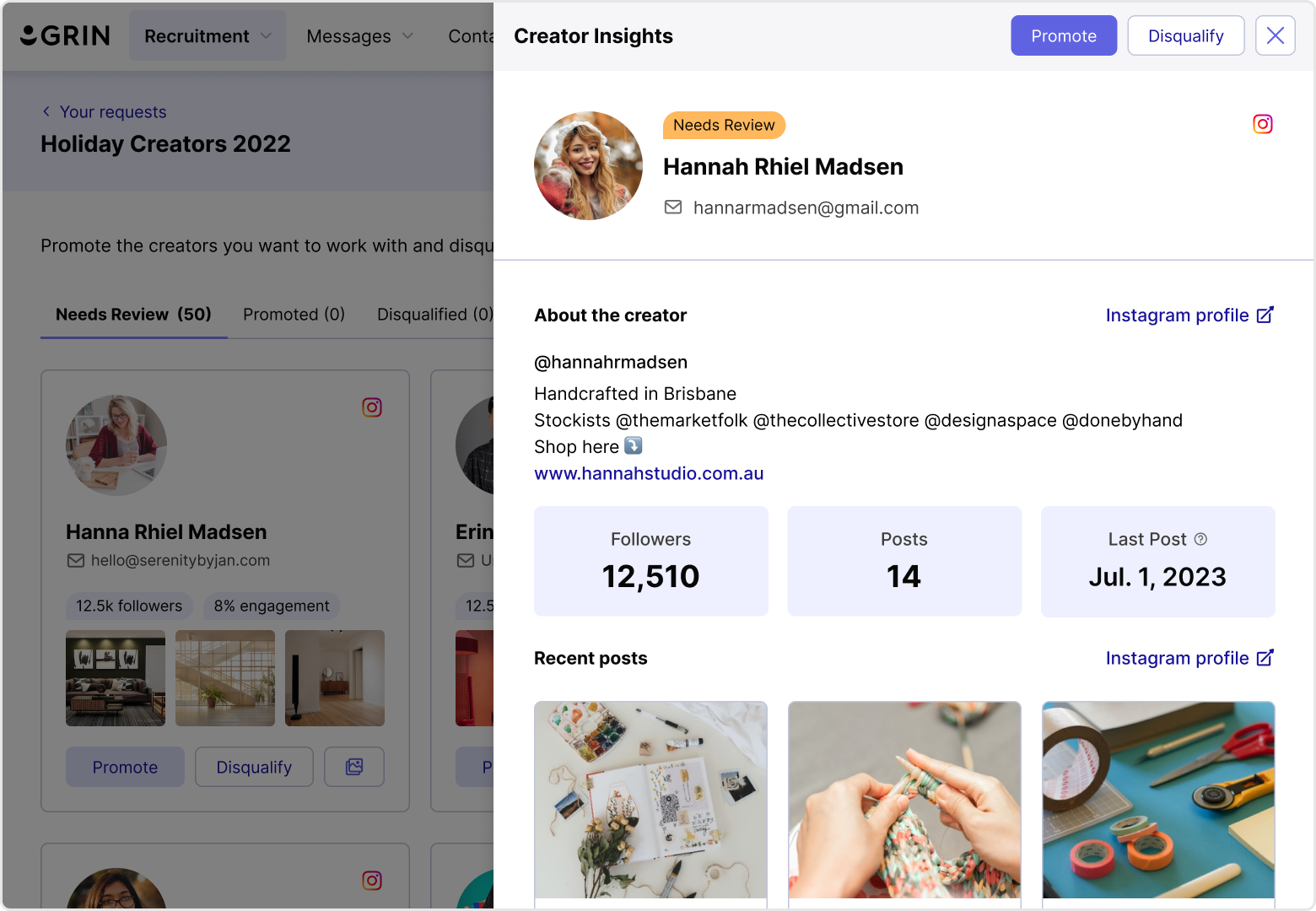
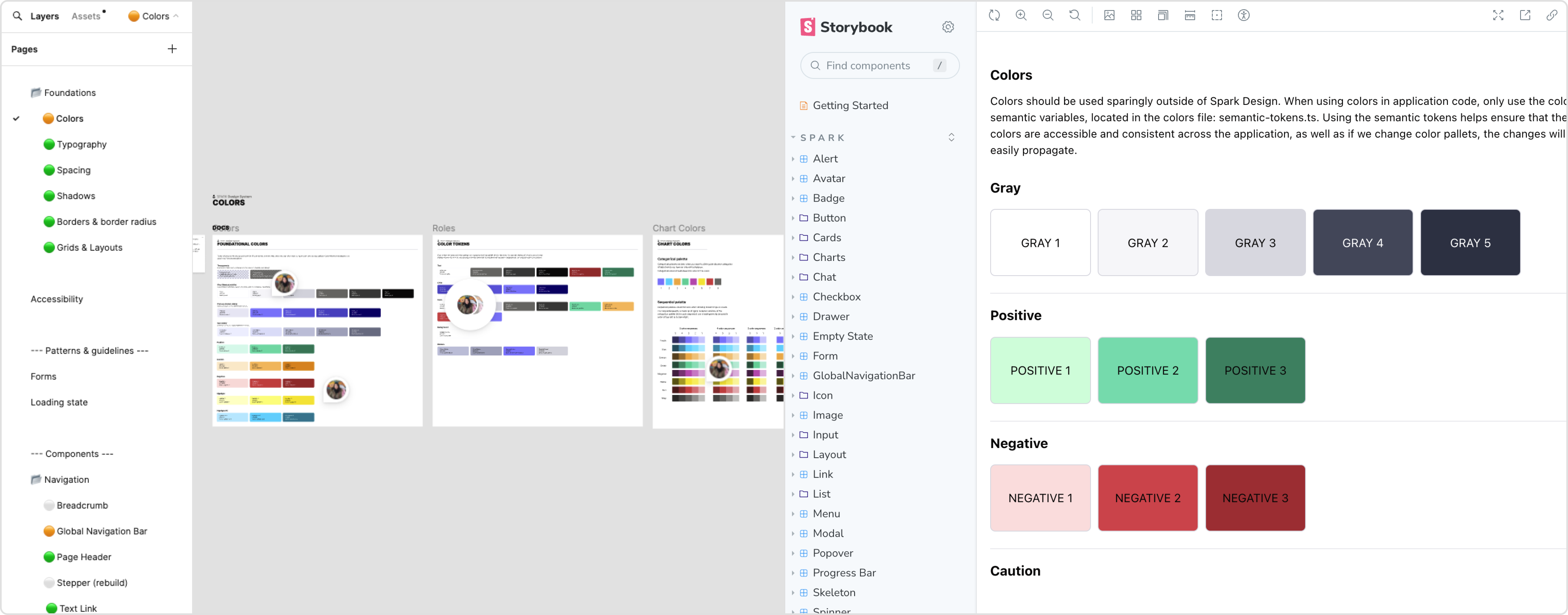
The early years of GRIN were marked by rapid growth and development. In its aftermath, we left a pile of technical and design debt that was difficult to unwravel due to lack of documentation and consistency in our design system. After years of getting by with a broken system, we finally paid our debts with Spark, GRIN's new design system.
← Back to Projects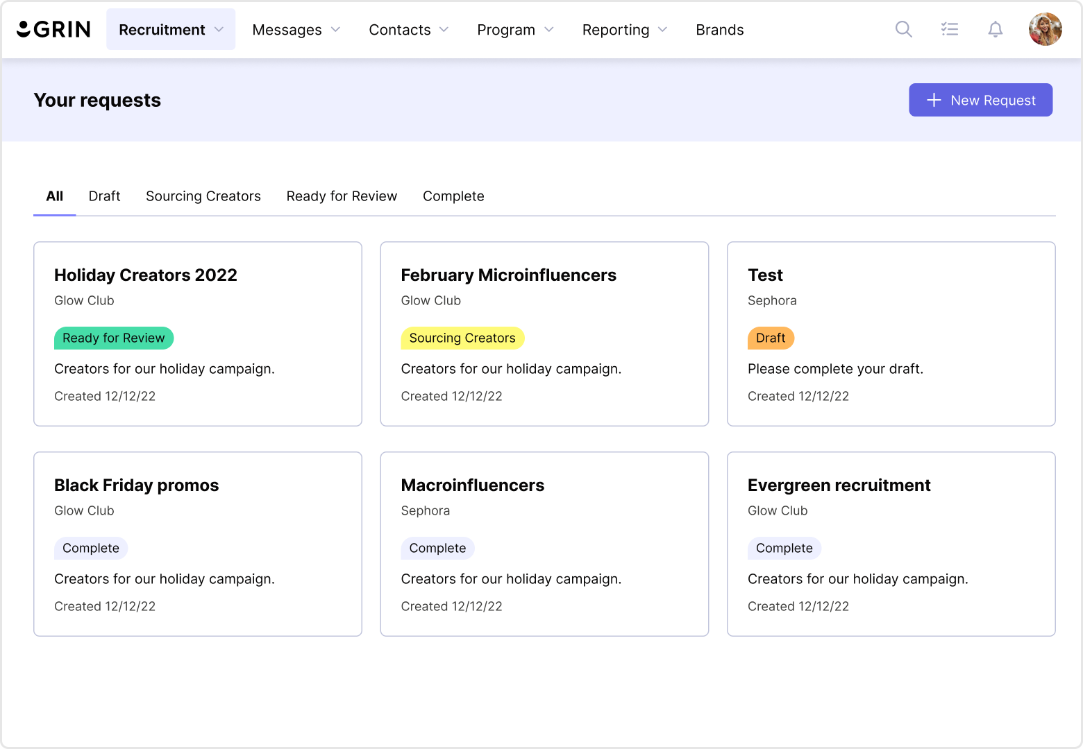
 hello@christinesiu.com
  LinkedIn
 Behance
 Vimeo
Vimeo